

Cool Beans Bingsu Logo Identity
Abe & Rachel approached me for a logo identity for their new dessert start-up concept serving a Korean-American take on the popular milk-based dessert known as “Pat-bingsu/bingsoo” in Korean. This classic Korean dessert is topped with fruits, condensed milk, and sweetened red beans, hence the name, Cool Beans. They were looking for a handcrafted, illustrated look to make the logo identity feel organic, fun, warm, and have a not-so-serious vibe, but also something that could play well into a modern setting.
In initial rounds, we explored color variations before they landed on the classic black & white version they use for their business today.
Responsibilities
Logo Identity
Illustration
Lettering
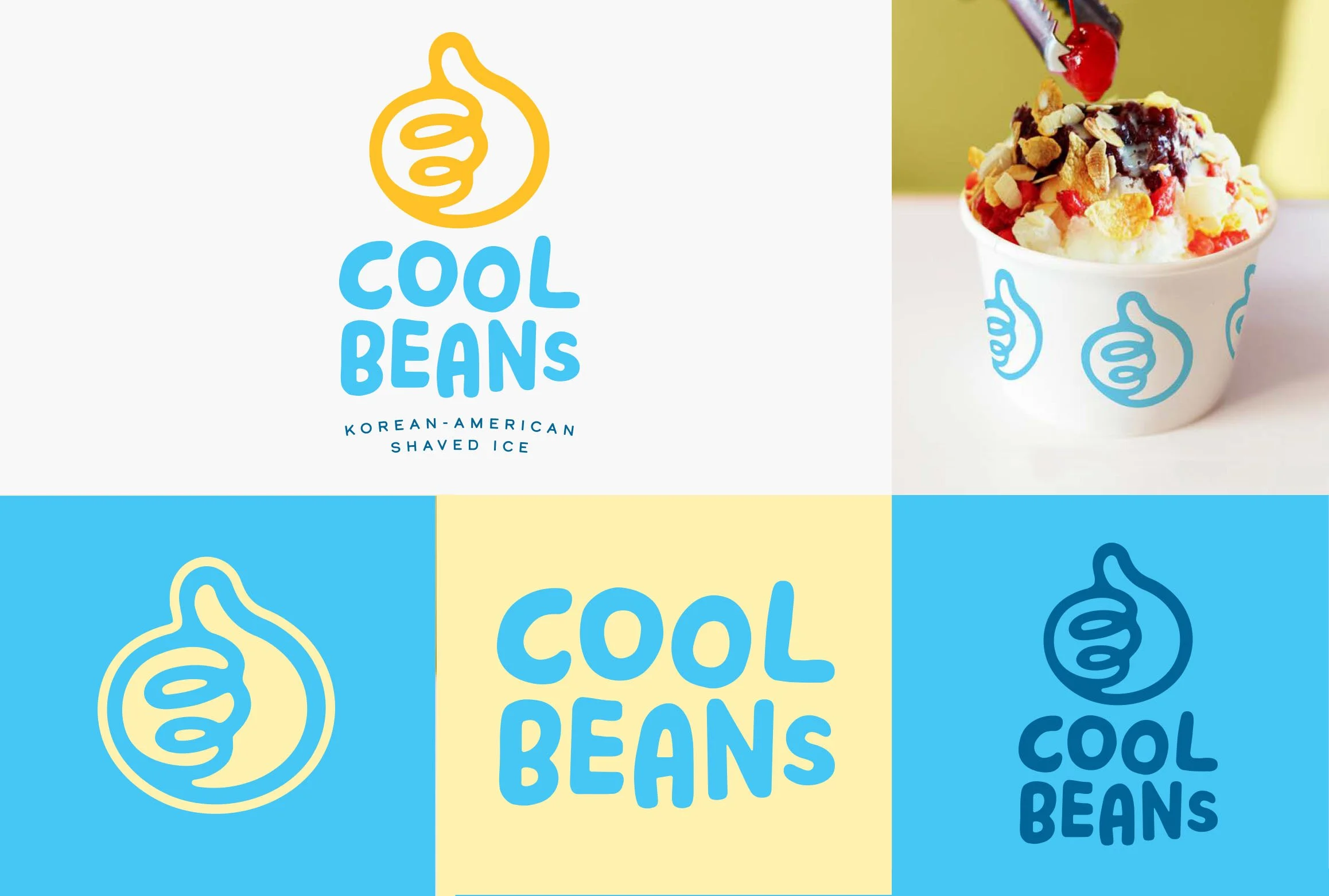
Logo Concept #1
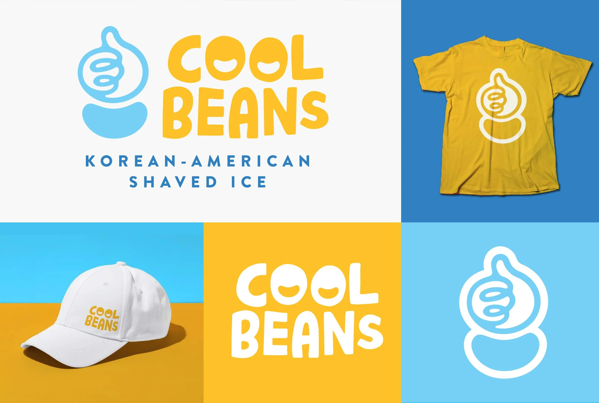
Logo Concept #2
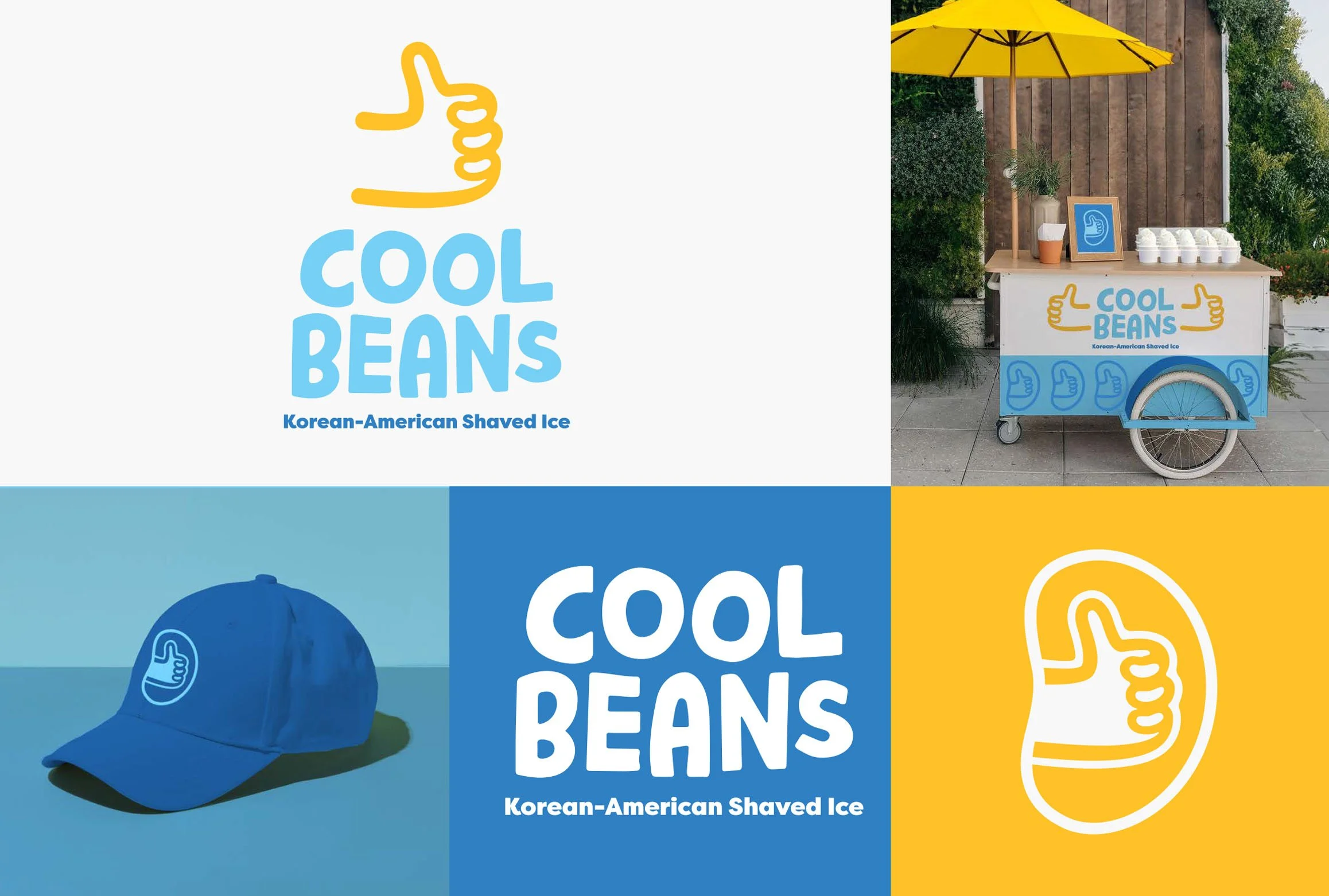
Logo Concept #3
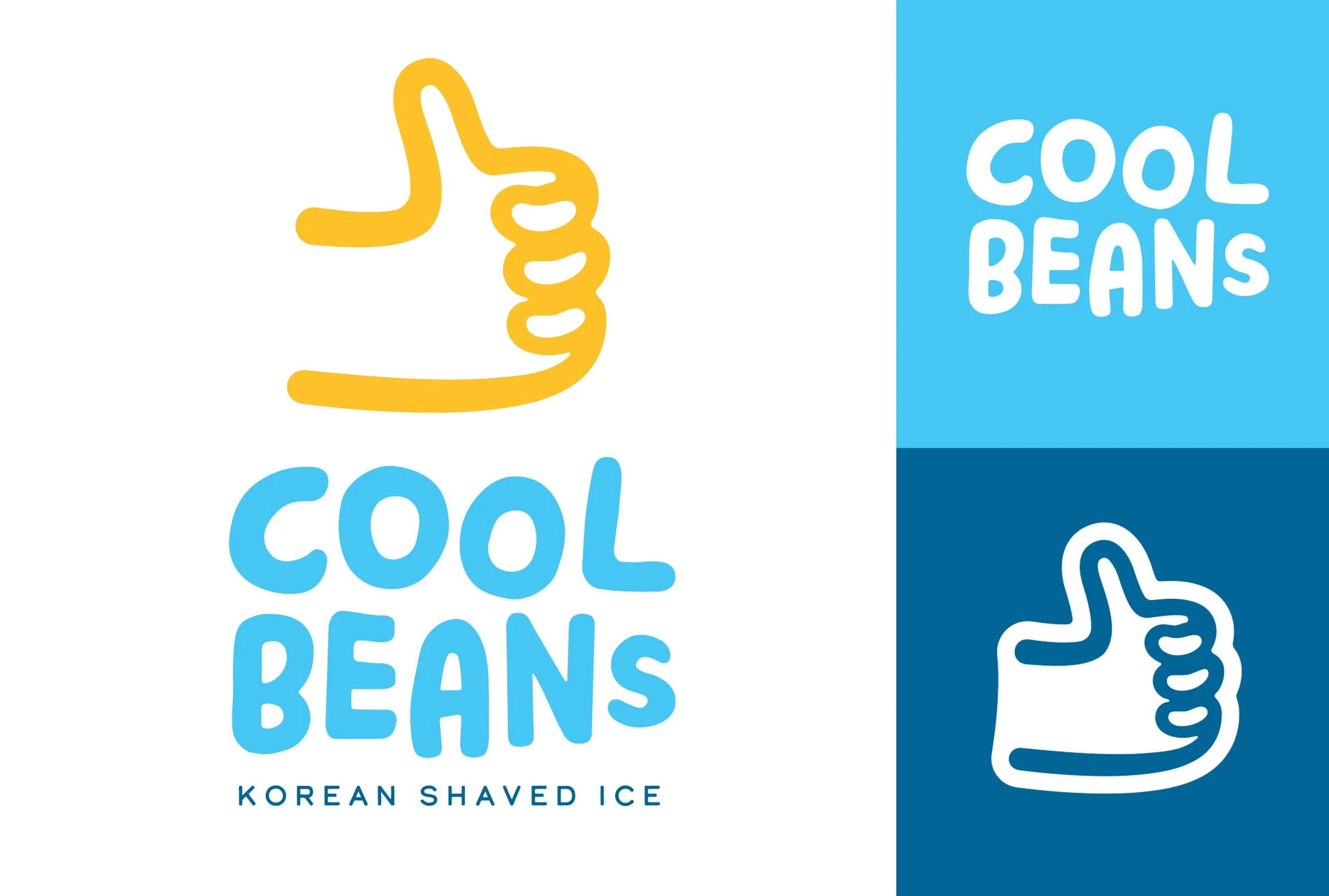
Round 2 Logo
Final Logo
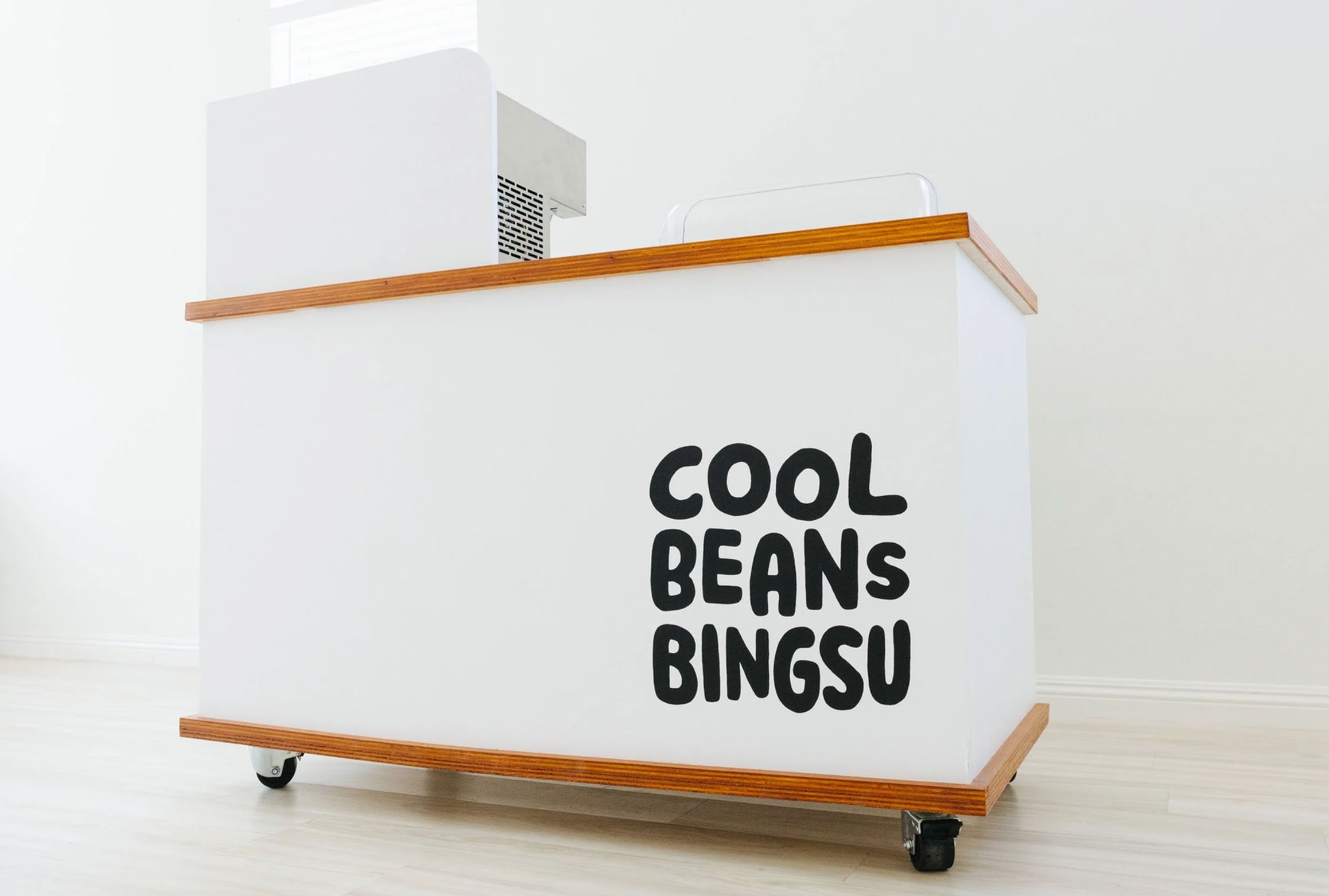
Bingsu cart. Photo courtesy of Cool Beans Bingsu.